Basic aspects of editorial layout for your digital magazine
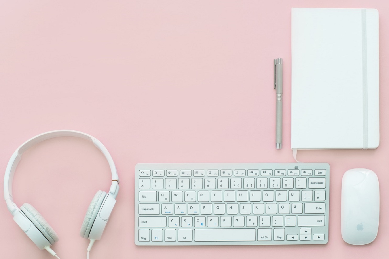
Designing a digital magazine is much more than placing texts, images and objects. Concepts related to graphic design, editorial design and editing are essential. And, of course, the common sense of the person in charge of performing this task.
A designer is responsible for defining aesthetics, typography, hierarchy levels of information or paragraph styles. The layout designer – often the same person who performs designer role- is the one who follows preestablished design parameters. Additionally, he works to achieve a design that fulfils its purpose in a logic and harmonious way.
One of the main keys to success when we design a magazine is using a plugin to layout. This tool should be easy for us to use in order to offer our readers an imperceptible layout that favours readability of the content and provides fluency to the text. This way, users’ experience is completely satisfactory.
This tool will be our best partner when creating attractive digital publications. However, it is always important to remember the basic aspects of a professional layout to achieve good results.
Premises to lay out a digital magazine
-
Double-page
The starting point is to design the pages from a double-page perspective. This is really important and helpful to establish margins, the explanatory sheet or the numbering of the page. If we face the layout with a double-page view, we will optimize the available space of the publication, which will also allow us to gain visual unity.
-
Reticles and margins
In order to establish a grid, we should define the size of the margins and the space allocated to the text, the images or any other element that we want to incorporate. In this moment, we should establish the proportions that better suit us the type of magazine we want to create. Do we want to write more? Do we want to prioritise graphic content? This is the moment to conceive and create a ground-breaking design.
-
Grid o base grid
We can’t forget this element, because it is the one that ensures that the pages harmoniously meet and do not differ between each other. The grid marks the guidelines that will guide us to add the different elements. It is convenient that all the pages keep coherence between them. Lines can also help us with this issue.
-
Last baseline
We can design some special pages in our digital magazine with a particular design, but as a rule all pages must end at the same height: in the last baseline of the grid. We can’t allow each page to end at a different height if it is not duly justified.
-
Widows and orphans
At last but not least, two typographical errors that tend to occur very often: widows and orphans: these are the lines or words that remain on a different page or column than the rest of the paragraph to which they belong. A good layout designer should solve these typographical issues playing with the separation of words or the tracking of paragraphs (for example).
The magazine you have in your mind only needs the perfect tool for digital publications. This tool shouldn’t be an impediment but an incentive to your creativity and imagination.
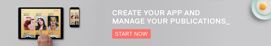
Büttonpublish