Apps’ usability and design: what is 2018 bringing?

2017 has been a successful year when we talk about apps’ usability and design. The vertiginous developing of technologic sector, continuous content and systems improvements, together with users learning of digital language are some of the factors that power this growth. But, what is 2018 bringing for us?
Today, we present 6 apps’ usability and design trends which will be common next year. In fact, you have probably noticed them already.
Modular design and progressive loading in apps’ usability and design
Thanks to modular design, content shown in our app is displayed according to the available space on the screen.
Additionally, progressive loading (content is progressively loaded as we scroll) provides better dynamism to the app, and user becomes an active player of it. This way, content appears and come to life when user interacts with the app.
Customized design
We all have seen many different publications and apps sharing the same pattern. In usability and interactive digital apps’ designing sector, templates save us some hours of work, but we should modify and adapt them according to brand’s identity and values. Using animations, effects, colors and corporative typographies is a good way of printing our personal stamp.
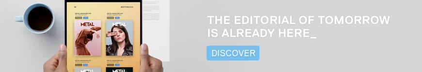
If you want to create your own customized digital publication, try our plugin and free-download effects.
Reducing loading time
An app’s loading time is one of the main inconveniences that users find while using it, and it frequently make them leave the platform.
So, there will be an extra effort in 2018 to solve this big handicap by reducing loading times. This way, users’ satisfaction will be greater.
In the specific case of Progressive Web Apps, one of the new 2018 challenges, content can be quickly displayed with no need of internet connection and using little storage capacity.
Long live color gradient
Together with flat design, bases and graphic elements with color gradients are still gaining more and more fans in apps’ design. This technic combines two colors and creates a unique atmosphere with a clean and minimalistic esthetic. Instagram’s logo transformation is a good example of it!
Negative spaces
When we talk about design, less is more. This way, a blurred background to generate context and focus the attention to text with big typography or to a graphic element; creates a great impact and visual attraction.
This simplicity and harmony is one of the best ways of driving users look to the places we want in order to get conversions.
Power of icons in apps’ usability and design
They are an efficient graphic resource, because their reduced size is not an impediment to communicate actions to users in an easy and attractive way.
Additionally, we can customize and adapt them or create our own icons to harmonize our digital app’s design.
Did you take note of these six trends to the next 2018?
You can progressively apply them in next editions of your interactive digital app. With no doubt, you will improve usability and user experience.
Büttonpublish