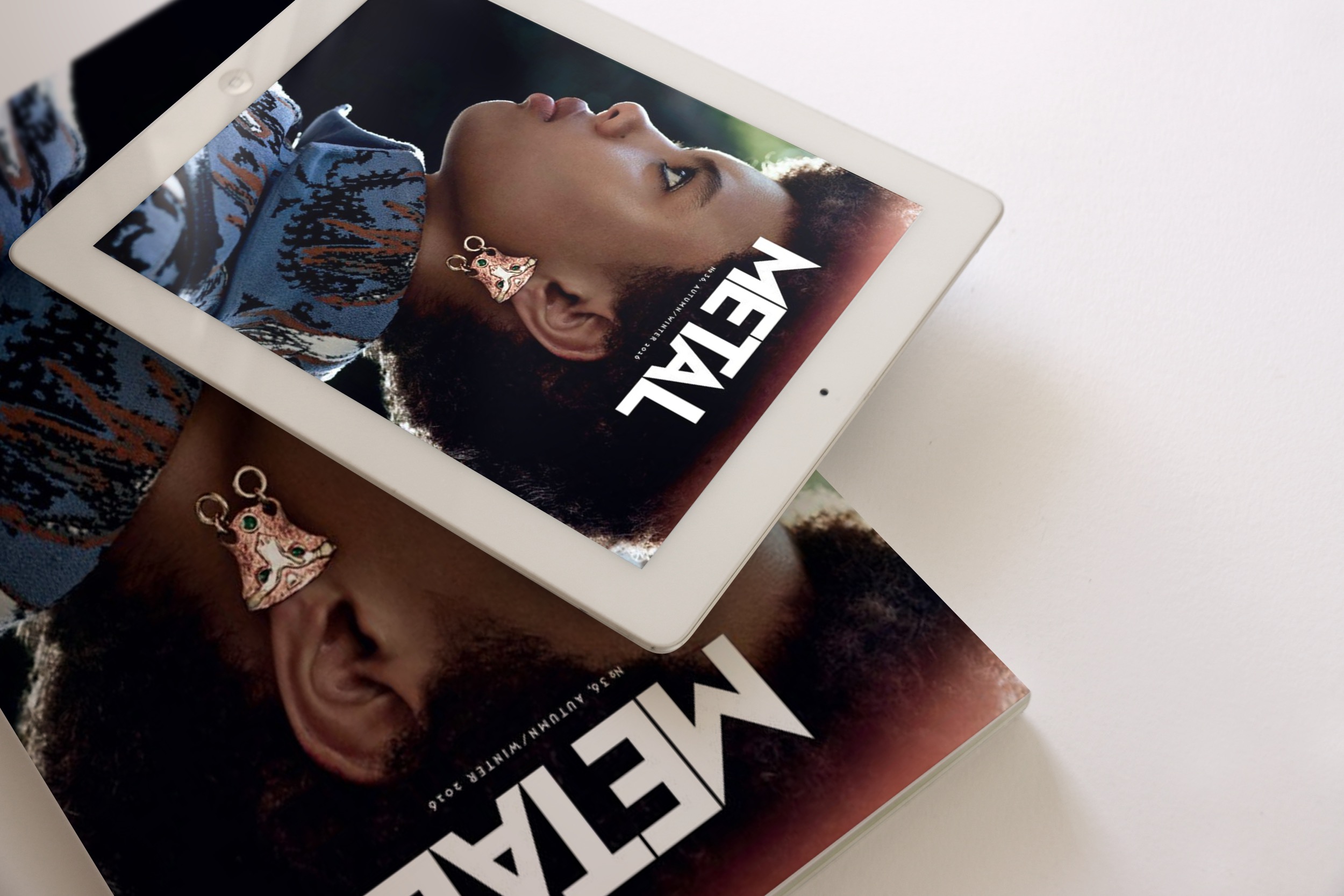
Five techniques to create attractive covers for digital magazines

When designing a digital magazine, we should take into consideration a large list of elements. Without any doubt, creating attractive covers is among them. A cover is probably the most important differentiating element. For example, if we take a look outside the digital environment, we notice the effort that all the different newspapers have historically destined (and they still destine every day) to offer a cover able to seduce readers who have no predilection for any specific newspaper in the kiosk.
In the same way, covers in digital magazines can encourage purchase, consumption of the publication and even loyalty to readers. But to achieve this, it is necessary to be aware of the digital art era and graphic design trends.
Trends in this sector are truly volatile: what today is considered as modern, tomorrow may be outdated. We can verify it with some techniques that have resisted for a long time and with many others that have lasted the same as a blink of an eye.
This year 2018, the trendiest innovations are related to experimental, creative and imaginative designs. So, how can we get those designs? The answer is easy: we can create them with a plugin to design with no need of programming knowledge and assuring an optimal result without a superlative effort. If we want to create attractive covers, it’s time to review trends in graphic design in 2018.
How to design a digital magazine: graphic design trends
- Effects
The glitch effect, the ruined effect and the color channels effect are the most popular trends in the digital world. The first one is characterized by a corrupt image that reproduces a failure of an artificial intelligence. Although this may be annoying at first sight, it has become a recurring effect nowadays; the second effect splashes, tears down and breaks any aesthetic composition in order to satisfy the art of destroying; Finally, the color channels effect aims to create illusory effects or distorted realities by playing with the color channels.
- Double
The double exposure through two superimposed images with the aim of surprising or double light to create a color effect that favors modern compositions are also rising trends. Now we don’t only see double, but we also design double.
- Typography
Creative typography is a common technique when we talk about graphic design trends (and will continue being a trend for several more years). It is a typeface that supports other techniques and whose main characteristic is a great imagination at the service of great results. In the same line of creation of creative content, we can also highlight the cut-out typeface. With this technique, letters are more difficult to read, but they have a better design. The chaotic typography is still present (since it was one of the trendiest resources last year) and, finally, the typography that is combined with elements of real life (like letters turned into mere objects) also have great importance in the sector.
- Negative graphic techniques
Negative graphic aesthetics tend to evoke positive sensations, so it is normal that it has emerged as a popular technique in recent years and that it still has an impact on the present. Neither can we forget the typography of negative space. With this technique, the different elements of the composition are distributed in anterior and posterior parts.
- Bright colors
Colors in 3D compositions are at the top of the trend lists. Their potential to make a design stand out guarantees that it will be a technique that will be trendy during the coming year too. The metallic elements are the perfect complement to these bright colors to create the always desired “WOW” effect.
Having a deep knowledge of the newest trends in the creation of digital magazines is what will open the doors of success not only in the design of attractive and unique covers, but in the design of entire publications.
Büttonpublish
